People are busy, impatient, and easily bored. They don’t have time to read through a complex list of your product’s technical features. Yes, some people will want more detail, and it should be available if they’re interested. (See what I did there?) But make sure there’s a low-investment option for drive-by buyers. “Simple” and “short” are related, even though they’re not exactly the same thing ;)
The ideal landing page format incorporates both short copy and long copy. In between those, you want a big ol’ button that people can click on to give you money. As stated in Kissmetrics’ blog post about looong landing pages:
“Place your call to action as early on in the process as possible. There will be some users who will convert early. You need to accommodate those users, by giving them the opportunity to convert.”
People can’t take actions that you don’t accommodate, and they’re less likely to take actions that you don’t encourage. Make the encouragement really obvious. Use the visual design as well as the text content to show people what actions they’re welcome to take. Even if you’re selling to adults, aim for a website that a fifth-grader would understand.
Lowest-common-denominator communication is not condescending — it’s actually very courteous! Don’t treat your potential customers like morons, but do treat them like professionals with priorities other than reading your marketing spiel. They just want to get on with their lives. If your tool can help them, awesome! But if it’s not immediately clear that you’re offering something useful, potential customers are gonna bounce.
Exolymph is going steady, and it’s sprouted a surprisingly active chat group. If you like talking about artificial intelligence and related sci-fi topics, I recommend joining. But the real reason I’m emailing you is that I recently launched two new projects:
Product Comms Club, a place to learn how to explain your product simply and directly. You can pre-order Product Communication Basics for 20% off the launch price! That’s $27.99 now versus $34.99 on May 2. [Edit: I changed the price to $14.99 because I reduced the scope.]
I feel kind of skeezy about trying to sell you all something, but on the other hand I truly believe that I can deliver value far in excess of $35. Any serious businessperson who buys Product Communication Basics will be getting a great deal, especially if writing and idea distillation are not their area(s) of expertise. Even if you don’t consider yourself a serious businessperson, the workbook could help you pitch your side projects and improve your communication skills in general.
Here’s another possibility: Exolymph has amassed enough subscribers that small-scale sponsorships would make sense. If you’re interested in doing that, just hit reply and let me know. I gotta make this pay at some point ¯\_(ツ)_/¯
As usual, if you’re working on something cool, I’d love to hear about it!
Humor me for a second. What is a landing page? At the core of things, it’s a website where your potential customer has arrived. You must have done something right to entice them there, so congratulate yourself on that part. (Maybe your marketing features a killer product pitch!) So what do you do with a potential customer once you have their attention? How do you advance from just having their attention to also having their money?
It’s actually very straightforward. Tell the visitor why they should give you their money — in exchange for something valuable — and then make it really easy for them to do that. I mean “really easy” in the most practical sense. A highly visible “BUY NOW” button is ideal, although it’s worth toning down the tackiness if you can. Require as little information from the customer as is practical. (Still, don’t disregard the lesson Candy Japan learned about credit card fraud.)
A landing page’s primary purpose is to present a certain action to the user and convince them to do it. Therefore the most essential element of any landing page is the button. A beautifully clickable button, bright pink or green or purple! That button might say “subscribe” or “add to cart” or even “pay $57.65” — the specific message is not the point. It’s all about the principle! Think Nike:
You should aim to give your website visitors the opportunity to JUST DO IT. If you don’t provide that option, even the most eager would-be users won’t be able to fork over their money. And remember, that’s your goal! Sweet, sweet scrilla $$$ ;)
A minimum viable landing page features a button for the user to click, and a reason for them to do it. It’s up to you to provide that reason.
Perhaps it’s a bit disingenuous for me to say that the button is the key thing, since it’s useless without a compelling pitch to the user. You really need both elements. (Sorry — most of the time, shortcuts are a distraction rather than a time-saver.) It’s so simple but so crucial and so much more difficult than it seems on the face of things: explain why the product you’re selling is worth paying for!
“People don’t buy software because of what it does, they buy it for the positive change it will make in [their] life.” — Patrick McKenzie
Here are some reasons for a user to buy something, in decreasing order of importance:
The product will help them make money.
The product will help them save money.
The product will eliminate their pain or frustration.
The product will cause them joy.
Ideally: all of the above. When you’re writing your landing page, you need to spell out how your product performs one of those four functions. If it doesn’t, you need to go back to the drawing board and keep working on what you’ve built.
Think about copywriting as a type of design. The goal of design is to make things usable and delightful, right? Words can jump-start the process. Effective copy explains the point of your product to people who haven’t tried it yet. Clear descriptions and calls to action can prompt readers to purchase your product, download it, set up an account, or [insert desired action here].
Thousands of people make products that they want other people to try. A small but meaningful subset offers something useful, something worth people’s time or money. My guess is that the majority of entrepreneurs who’ve built a useful product get stuck at that stage, because they don’t communicate what it does or how it will solve people’s problems. Product-market fit is meaningless if you can’t convince the market to pay attention!
(Throughout this article I’m going to use “product” as a blanket term for “thing or service that you’re selling or trying to convince people to use”. Fill in your own blank. “Landing page” should also be interpreted expansively — it might be your website, your App Store listing, or even a Google search result.)
Here are the three essential components of a new or unknown company’s landing page:
Concrete explanation of what your product or service is. Don’t be afraid to be literal.
Value proposition, AKA why potential users should be interested.
Call to action, ideally a form that can be filled out without navigating to another page.
That’s all you need! Hopefully every one of these three things is visible without having to scroll down. Put your short copy on top and push any longer copy below. Go ahead and write the longer copy if you think it’ll be helpful, but make sure it doesn’t supersede the crucial message on top. People should be able to look at your website for ten seconds and understand:
What your product is and how they would interact with it.
Why they might want to do so. What’s the benefit?
The next action they should take if they want to go forward.
In fact, setting up an effective landing page is a lot like designing a billboard. Mattermark does a great job:
“Join over 500 companies using Mattermark to discover high quality leads, prioritize prospects, and better track their customers. Get started today.” Plus, obvious search bar is obvious. The only thing I’d change is putting a suggestion in there, e.g. “Start your search with [example term]…” Screenshot taken 3/21/2016.Unfortunately, not everyone is executing as well as Mattermark. Many novice startups try to emulate the landing pages of highly successful companies — to a fault. Copying the winners seems like a common-sense move, but it misses the key difference between what a giant like Google and Facebook needs to communicate versus what an obscure startup needs to communicate.
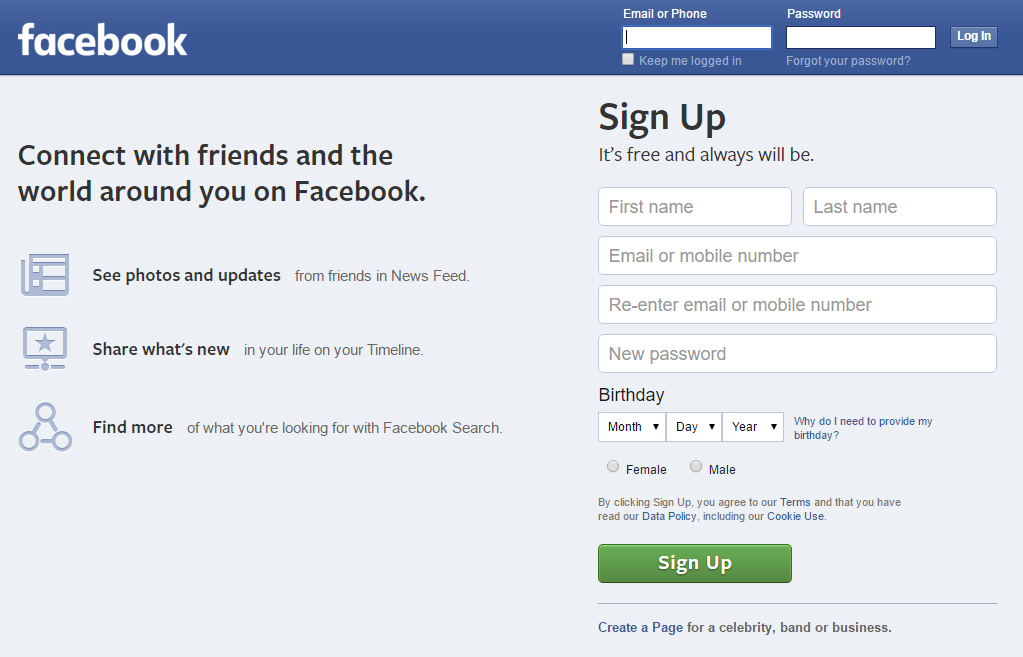
Google.com can be a search engine with no onboarding because its use and purpose is common knowledge. Similarly, Facebook.com doesn’t need to explain its social network because most of their website visitors arrive with at least a rudimentary understanding of “friending” and the News Feed. Facebook could skip straight to the value proposition, although their logged-out landing page is actually pretty concrete:
Facebook’s landing page is nearly perfect, except for the emphasis on search, which I object to on dual grounds. Facebook’s search is garbage and it’s beside the point — their core value proposition is about connecting with people you know. Screenshot taken 3/21/2016.
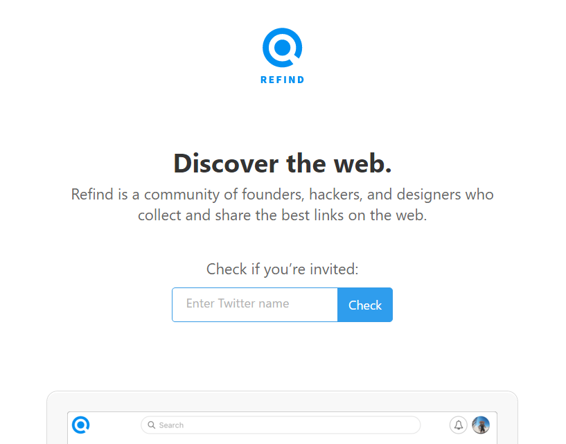
I also want to give an example of someone who is doing it wrong, in my estimation: Refind, a service for saving links. I already pointed this out on Twitter, and to the company’s credit, their founder was very open to criticism. I’m not trying to pick on Refind, but their landing page is a great demonstration of damaging vagueness. Before I explain what the Refind service does, here’s their landing page:
“Discover the web. Refind is a community of founders, hackers, and designers who collect and share the best links on the web.” Screenshot taken 3/21/2016.
From their blurb, I can gather this: Refind is a link-related service and they’re targeting people who work in tech. But I have no idea what the product actually does! “Link-related” is a huge space. My first guess was “Reddit meets Instapaper” — nope, totally wrong. If you’re pitching people on a product, this is a bad reaction to get. Website visitors should not be making wild guesses about what your product is. Communicating that should be your top priority. Here’s how I would rewrite Refind’s blurb:
Use our browser extension to save valuable links, and we’ll insert them into your relevant Google searches later. Join a community of founders, hackers, [and so on].
Below that, a cleaned-up screenshot of what a Refind link looks like when pre-populated into Google results. For example, you could save the article that you’re reading right now and tag it “copywriting”, “product description”, etc. If you searched adjacent terms in the future, Refind would offer you this link again.
That’s it. The concepts are fairly simple. I’ll reiterate the list of top priorities for a new entrant’s landing page:
Concrete explanation of what your product or service is. Don’t be afraid to be literal.
Value proposition, AKA why potential users should be interested.
Call to action, ideally a form that can be filled out without navigating to another page.
My thesis here is that website visitors who don’t understand what you’re offering are far less likely to pull the trigger. Thus the emphasis on specificity, and connecting all the dots for people right away. Make it easy for them to make a decision. Again, this is how copywriting can be thought of as a type of design — it guides the user toward your desired mindset and shows them what they should do.
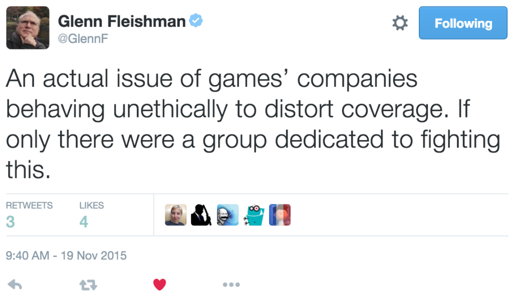
Stephen Totilo, the editor-in-chief of video-game blog Kotaku, just published a piece alleging that Kotaku has been ill-treated by two very large video-game studios:
For the past two years, Kotaku has been blacklisted by Bethesda, the publisher of the Fallout and Elder Scrolls series. For the past year, we have also been, to a lesser degree, ostracized by Ubisoft, publisher of Assassin’s Creed, Far Cry and more.
In those periods of time, the PR and marketing wings of those two gaming giants have chosen to act as if Kotaku doesn’t exist. They’ve cut off our access to their games and creators, omitted us from their widespread mailings of early review copies and, most galling, ignored all of our requests for comment on any news stories.
I used the word “alleging” not because I don’t believe that Kotaku has been stonewalled, but because I disagree that the companies are doing anything wrong. Yes, it would be annoying — even infuriating — to be cut off, and I support Kotaku’s right to publicize the issue. But I object to Totilo’s implicit attitude of entitlement. And I disagree with everyone who thinks that Bethesda and Ubisoft are behaving unethically. That position depends on the idea that journalists deserve access, that they have some inherent right to interviews, review copies, and answered emails. They don’t.
Too many big game publishers cling to an irrational expectation of secrecy and are rankled when the press shows them how unrealistic they’re being. There will always be a clash between independent reporters and those seek to control information, but many of these companies appear to believe that it is actually possible in 2015 for hundreds of people to work dozens of months on a video game and for no information about the project to seep out. They appear to believe that the general public will not find out about these games until their marketing plans say it’s time. They operate with the assumption that the press will not upend these plans, and should the press defy their assumption, they bring down the hammer. […] Millions of people still read our stories about them. The companies just leave themselves a little more out of the equation.
True, it’s silly to expect to be able to keep information totally under wraps in the Internet Age. But with respect to Bethesda and Ubisoft “bring[ing] down the hammer” and absconding as much as possible — yes, that is their intent! They think it’s a wise business decision — whether that’s true is irrelevant to my point. The whole point of PR and marketing divisions is to propagate the perspective you want and quash the one you don’t. A method of quashing is limiting access. It would make no sense for Bethesda and Ubisoft to throw the doors open to Kotaku and welcome all scrutiny.
For the better part of two years, two of the biggest video game publishers in the world have done their damnedest to make it as difficult as possible for Kotaku to cover their games. They have done so in apparent retaliation for the fact that we did our jobs as reporters and as critics. We told the truth about their games, sometimes in ways that disrupted a marketing plan, other times in ways that shone an unflattering light on their products and company practices. Both publishers’ actions demonstrate contempt for us and, by extension, the whole of the gaming press. They would hamper independent reporting in pursuit of a status quo in which video game journalists are little more than malleable, servile arms of a corporate sales apparatus. It is a state of affairs that we reject.
Totilo and Kotaku’s staff are free to reject this “state of affairs”, but Bethesda and Ubisoft are also free to ignore them. Crucially, Bethesda and Ubisoft are not violating any obligation or doing anything wrong. They never made a promise to renege on. The companies are acting to further their own plans, which have nothing to do with disseminating information to an ad-viewing gamer public (which is Kotaku’s goal). Are they being immature? Maybe — that’s a different argument. Is the tactic counter-effective, as Totilo seems to think? Also a separate discussion — but it’s definitely not evil. It’s just corporate.
Note: I wrote this quickly so I’m probably going to fix typos and wording later.
I am a member of the Amazon Associates program. If you click on an Amazon link from this site and subsequently buy something, I may receive a small commission (at no cost to you).