Humor me for a second. What is a landing page? At the core of things, it’s a website where your potential customer has arrived. You must have done something right to entice them there, so congratulate yourself on that part. (Maybe your marketing features a killer product pitch!) So what do you do with a potential customer once you have their attention? How do you advance from just having their attention to also having their money?
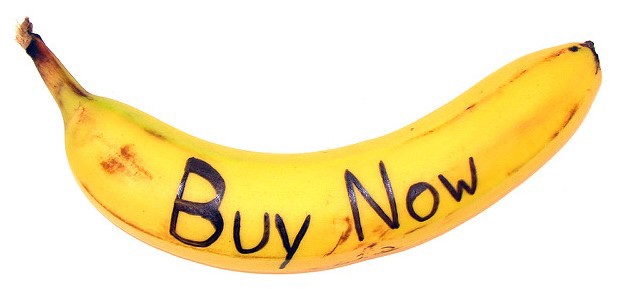
It’s actually very straightforward. Tell the visitor why they should give you their money — in exchange for something valuable — and then make it really easy for them to do that. I mean “really easy” in the most practical sense. A highly visible “BUY NOW” button is ideal, although it’s worth toning down the tackiness if you can. Require as little information from the customer as is practical. (Still, don’t disregard the lesson Candy Japan learned about credit card fraud.)
A landing page’s primary purpose is to present a certain action to the user and convince them to do it. Therefore the most essential element of any landing page is the button. A beautifully clickable button, bright pink or green or purple! That button might say “subscribe” or “add to cart” or even “pay $57.65” — the specific message is not the point. It’s all about the principle! Think Nike:
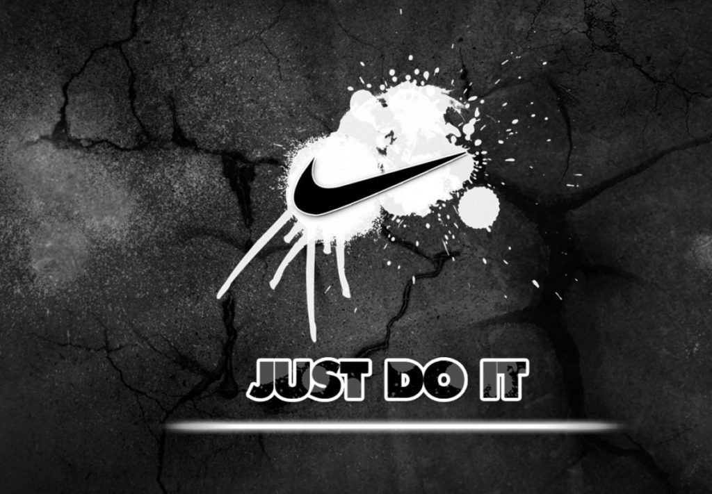
You should aim to give your website visitors the opportunity to JUST DO IT. If you don’t provide that option, even the most eager would-be users won’t be able to fork over their money. And remember, that’s your goal! Sweet, sweet scrilla $$$ ;)
A minimum viable landing page features a button for the user to click, and a reason for them to do it. It’s up to you to provide that reason.
Perhaps it’s a bit disingenuous for me to say that the button is the key thing, since it’s useless without a compelling pitch to the user. You really need both elements. (Sorry — most of the time, shortcuts are a distraction rather than a time-saver.) It’s so simple but so crucial and so much more difficult than it seems on the face of things: explain why the product you’re selling is worth paying for!
“People don’t buy software because of what it does, they buy it for the positive change it will make in [their] life.” — Patrick McKenzie
Here are some reasons for a user to buy something, in decreasing order of importance:
- The product will help them make money.
- The product will help them save money.
- The product will eliminate their pain or frustration.
- The product will cause them joy.
Ideally: all of the above. When you’re writing your landing page, you need to spell out how your product performs one of those four functions. If it doesn’t, you need to go back to the drawing board and keep working on what you’ve built.
Did you find this useful? Then go ahead and buy Product Communication Basics!