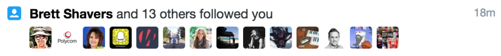
I’m joining the grand tradition of ragging on Twitter for its weird and bad design choices! Let’s zoom in on a particular feature that I dislike. Here’s a notification that Twitter presents to me every day, from which I derive zero delight:
Brett Shavers is legit, but 90% of these people use spammy hashtags in their profiles.
It is good that Twitter collapses distinct follow events into one notification. Unfortunately, I still feel negative about the experience. Being followed on social media has the potential to generate joy — hooray, people are paying attention to me! — but the reality is closer to getting an unsolicited sales call.
What if Twitter defaulted to not notifying me of new followers? That would keep my focus on conversations — where my focus naturally wants to be anyway — instead of urging me to grind my user stats upward. There’s no reason why Twitter must deliver a notification when someone follows you. What if you had to manually look at your list of followers to check on this? People would still do it, of course, but it wouldn’t be a behavior encouraged by the platform’s design.
Getting rid of the “people followed you!” notification might also cut down on the amount of #marketing and bot accounts that insta-follow me based on keywords in my tweets. From their perspective, the utility of following me would be lessened because Twitter’s design wouldn’t assist them in shoving their messages in front of my eyeballs. On the other hand, the change might encourage those accounts to proactively tweet at me, which would be horrible. I think it’s at least worth A/B testing to see what the actual behavior is.
Of course, changing this notification feature would be treating the symptom rather than the sickness. Well… sometimes you gotta do that. Eliminating the problem altogether would involve fundamentally changing how Twitter works, which I don’t want. Public broadcast systems naturally attract spam, but you can mitigate the effect on genuine users.
Think about copywriting as a type of design. The goal of design is to make things usable and delightful, right? Words can jump-start the process. Effective copy explains the point of your product to people who haven’t tried it yet. Clear descriptions and calls to action can prompt readers to purchase your product, download it, set up an account, or [insert desired action here].
Thousands of people make products that they want other people to try. A small but meaningful subset offers something useful, something worth people’s time or money. My guess is that the majority of entrepreneurs who’ve built a useful product get stuck at that stage, because they don’t communicate what it does or how it will solve people’s problems. Product-market fit is meaningless if you can’t convince the market to pay attention!
(Throughout this article I’m going to use “product” as a blanket term for “thing or service that you’re selling or trying to convince people to use”. Fill in your own blank. “Landing page” should also be interpreted expansively — it might be your website, your App Store listing, or even a Google search result.)
Here are the three essential components of a new or unknown company’s landing page:
Concrete explanation of what your product or service is. Don’t be afraid to be literal.
Value proposition, AKA why potential users should be interested.
Call to action, ideally a form that can be filled out without navigating to another page.
That’s all you need! Hopefully every one of these three things is visible without having to scroll down. Put your short copy on top and push any longer copy below. Go ahead and write the longer copy if you think it’ll be helpful, but make sure it doesn’t supersede the crucial message on top. People should be able to look at your website for ten seconds and understand:
What your product is and how they would interact with it.
Why they might want to do so. What’s the benefit?
The next action they should take if they want to go forward.
In fact, setting up an effective landing page is a lot like designing a billboard. Mattermark does a great job:
“Join over 500 companies using Mattermark to discover high quality leads, prioritize prospects, and better track their customers. Get started today.” Plus, obvious search bar is obvious. The only thing I’d change is putting a suggestion in there, e.g. “Start your search with [example term]…” Screenshot taken 3/21/2016.Unfortunately, not everyone is executing as well as Mattermark. Many novice startups try to emulate the landing pages of highly successful companies — to a fault. Copying the winners seems like a common-sense move, but it misses the key difference between what a giant like Google and Facebook needs to communicate versus what an obscure startup needs to communicate.
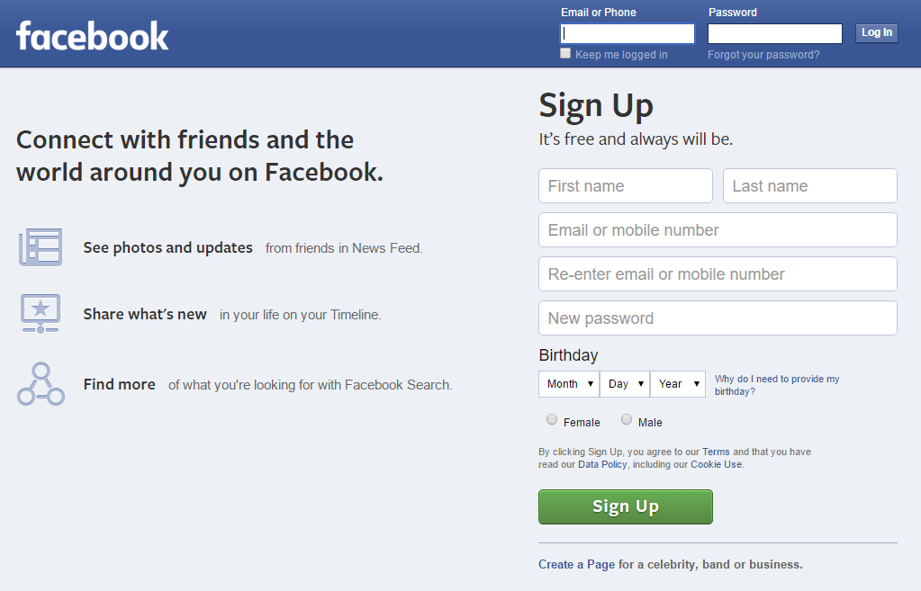
Google.com can be a search engine with no onboarding because its use and purpose is common knowledge. Similarly, Facebook.com doesn’t need to explain its social network because most of their website visitors arrive with at least a rudimentary understanding of “friending” and the News Feed. Facebook could skip straight to the value proposition, although their logged-out landing page is actually pretty concrete:
Facebook’s landing page is nearly perfect, except for the emphasis on search, which I object to on dual grounds. Facebook’s search is garbage and it’s beside the point — their core value proposition is about connecting with people you know. Screenshot taken 3/21/2016.
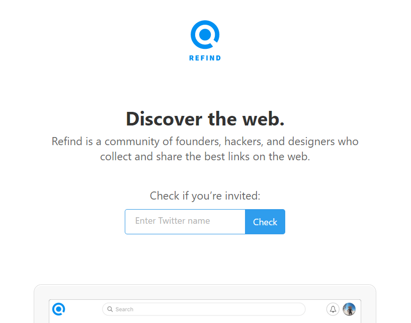
I also want to give an example of someone who is doing it wrong, in my estimation: Refind, a service for saving links. I already pointed this out on Twitter, and to the company’s credit, their founder was very open to criticism. I’m not trying to pick on Refind, but their landing page is a great demonstration of damaging vagueness. Before I explain what the Refind service does, here’s their landing page:
“Discover the web. Refind is a community of founders, hackers, and designers who collect and share the best links on the web.” Screenshot taken 3/21/2016.
From their blurb, I can gather this: Refind is a link-related service and they’re targeting people who work in tech. But I have no idea what the product actually does! “Link-related” is a huge space. My first guess was “Reddit meets Instapaper” — nope, totally wrong. If you’re pitching people on a product, this is a bad reaction to get. Website visitors should not be making wild guesses about what your product is. Communicating that should be your top priority. Here’s how I would rewrite Refind’s blurb:
Use our browser extension to save valuable links, and we’ll insert them into your relevant Google searches later. Join a community of founders, hackers, [and so on].
Below that, a cleaned-up screenshot of what a Refind link looks like when pre-populated into Google results. For example, you could save the article that you’re reading right now and tag it “copywriting”, “product description”, etc. If you searched adjacent terms in the future, Refind would offer you this link again.
That’s it. The concepts are fairly simple. I’ll reiterate the list of top priorities for a new entrant’s landing page:
Concrete explanation of what your product or service is. Don’t be afraid to be literal.
Value proposition, AKA why potential users should be interested.
Call to action, ideally a form that can be filled out without navigating to another page.
My thesis here is that website visitors who don’t understand what you’re offering are far less likely to pull the trigger. Thus the emphasis on specificity, and connecting all the dots for people right away. Make it easy for them to make a decision. Again, this is how copywriting can be thought of as a type of design — it guides the user toward your desired mindset and shows them what they should do.
I am a member of the Amazon Associates program. If you click on an Amazon link from this site and subsequently buy something, I may receive a small commission (at no cost to you).