“Companies that use innovative and data-driven analytical approaches to marketing are found to have the highest success rate of conversions on their website.” — WeSpotlight
In case you’re not familiar with A/B testing, here’s a quick definition from Visual Website Optimizer: “A/B testing (sometimes called split testing) is comparing two versions of a web page to see which one performs better. You compare two web pages by showing the two variants (let’s call them A and B) to similar visitors at the same time.” Then you record how those website visitors behaved differently based on which version they were shown.
After analyzing the data, you keep whichever design performed better, discard the other one, and start the process again with a new tweak. Over time, you iterate toward the Holy Grail: a perfect landing page that converts 100%! Jkjk, that’s impossible — but you can certainly improve your baseline. A/B testing is a simple way to ensure that the changes you make are doing what they’re supposed to.
This is obviously a very clever idea. Equally obviously it takes time and energy to pull it off. If you have limited resources and you’re forced to be ruthless about where you focus your effort, is it worth it to A/B test? You have to come up with website variations, deploy your A/B testing tool(s), and then wait for enough visitors to be processed. The concept is simple, but the execution is often lacking. From the Kissmetrics blog:
“A/B tests are designed to imitate scientific experiments, but most marketers running A/B Tests do not live in a world that is anything like a lab at a university. The stumbling point is that people running A/B tests are supposed to wait and not peak at the results until the test is done, but many marketers won’t do that.”
As a bootstrapping entrepreneur, maybe with a day job to balance, it’s important to evaluate where your energy will have the highest impact. Of course, “is it worth it to A/B test?” is one of those trick questions: the real answer is that you have to weigh your priorities and decide for yourself.
This issue is on my mind right now because I’m personally debating whether I can justify spending time and effort A/B testing the Product Communication Basics landing page. And I think the answer is… no. Here’s why: opportunity cost.
Investopedia handily defines opportunity cost as “the cost of an alternative that must be forgone in order to pursue a certain action. Put another way, the benefits you could have received by taking an alternative action.” Right now I don’t even have enough website traffic to get statistically reliable results from an A/B test! So I’m gonna work on that first. Hi Reddit ;)
People are busy, impatient, and easily bored. They don’t have time to read through a complex list of your product’s technical features. Yes, some people will want more detail, and it should be available if they’re interested. (See what I did there?) But make sure there’s a low-investment option for drive-by buyers. “Simple” and “short” are related, even though they’re not exactly the same thing ;)
The ideal landing page format incorporates both short copy and long copy. In between those, you want a big ol’ button that people can click on to give you money. As stated in Kissmetrics’ blog post about looong landing pages:
“Place your call to action as early on in the process as possible. There will be some users who will convert early. You need to accommodate those users, by giving them the opportunity to convert.”
People can’t take actions that you don’t accommodate, and they’re less likely to take actions that you don’t encourage. Make the encouragement really obvious. Use the visual design as well as the text content to show people what actions they’re welcome to take. Even if you’re selling to adults, aim for a website that a fifth-grader would understand.
Lowest-common-denominator communication is not condescending — it’s actually very courteous! Don’t treat your potential customers like morons, but do treat them like professionals with priorities other than reading your marketing spiel. They just want to get on with their lives. If your tool can help them, awesome! But if it’s not immediately clear that you’re offering something useful, potential customers are gonna bounce.
Humor me for a second. What is a landing page? At the core of things, it’s a website where your potential customer has arrived. You must have done something right to entice them there, so congratulate yourself on that part. (Maybe your marketing features a killer product pitch!) So what do you do with a potential customer once you have their attention? How do you advance from just having their attention to also having their money?
It’s actually very straightforward. Tell the visitor why they should give you their money — in exchange for something valuable — and then make it really easy for them to do that. I mean “really easy” in the most practical sense. A highly visible “BUY NOW” button is ideal, although it’s worth toning down the tackiness if you can. Require as little information from the customer as is practical. (Still, don’t disregard the lesson Candy Japan learned about credit card fraud.)
A landing page’s primary purpose is to present a certain action to the user and convince them to do it. Therefore the most essential element of any landing page is the button. A beautifully clickable button, bright pink or green or purple! That button might say “subscribe” or “add to cart” or even “pay $57.65” — the specific message is not the point. It’s all about the principle! Think Nike:
You should aim to give your website visitors the opportunity to JUST DO IT. If you don’t provide that option, even the most eager would-be users won’t be able to fork over their money. And remember, that’s your goal! Sweet, sweet scrilla $$$ ;)
A minimum viable landing page features a button for the user to click, and a reason for them to do it. It’s up to you to provide that reason.
Perhaps it’s a bit disingenuous for me to say that the button is the key thing, since it’s useless without a compelling pitch to the user. You really need both elements. (Sorry — most of the time, shortcuts are a distraction rather than a time-saver.) It’s so simple but so crucial and so much more difficult than it seems on the face of things: explain why the product you’re selling is worth paying for!
“People don’t buy software because of what it does, they buy it for the positive change it will make in [their] life.” — Patrick McKenzie
Here are some reasons for a user to buy something, in decreasing order of importance:
The product will help them make money.
The product will help them save money.
The product will eliminate their pain or frustration.
The product will cause them joy.
Ideally: all of the above. When you’re writing your landing page, you need to spell out how your product performs one of those four functions. If it doesn’t, you need to go back to the drawing board and keep working on what you’ve built.
Think about copywriting as a type of design. The goal of design is to make things usable and delightful, right? Words can jump-start the process. Effective copy explains the point of your product to people who haven’t tried it yet. Clear descriptions and calls to action can prompt readers to purchase your product, download it, set up an account, or [insert desired action here].
Thousands of people make products that they want other people to try. A small but meaningful subset offers something useful, something worth people’s time or money. My guess is that the majority of entrepreneurs who’ve built a useful product get stuck at that stage, because they don’t communicate what it does or how it will solve people’s problems. Product-market fit is meaningless if you can’t convince the market to pay attention!
(Throughout this article I’m going to use “product” as a blanket term for “thing or service that you’re selling or trying to convince people to use”. Fill in your own blank. “Landing page” should also be interpreted expansively — it might be your website, your App Store listing, or even a Google search result.)
Here are the three essential components of a new or unknown company’s landing page:
Concrete explanation of what your product or service is. Don’t be afraid to be literal.
Value proposition, AKA why potential users should be interested.
Call to action, ideally a form that can be filled out without navigating to another page.
That’s all you need! Hopefully every one of these three things is visible without having to scroll down. Put your short copy on top and push any longer copy below. Go ahead and write the longer copy if you think it’ll be helpful, but make sure it doesn’t supersede the crucial message on top. People should be able to look at your website for ten seconds and understand:
What your product is and how they would interact with it.
Why they might want to do so. What’s the benefit?
The next action they should take if they want to go forward.
In fact, setting up an effective landing page is a lot like designing a billboard. Mattermark does a great job:
“Join over 500 companies using Mattermark to discover high quality leads, prioritize prospects, and better track their customers. Get started today.” Plus, obvious search bar is obvious. The only thing I’d change is putting a suggestion in there, e.g. “Start your search with [example term]…” Screenshot taken 3/21/2016.Unfortunately, not everyone is executing as well as Mattermark. Many novice startups try to emulate the landing pages of highly successful companies — to a fault. Copying the winners seems like a common-sense move, but it misses the key difference between what a giant like Google and Facebook needs to communicate versus what an obscure startup needs to communicate.
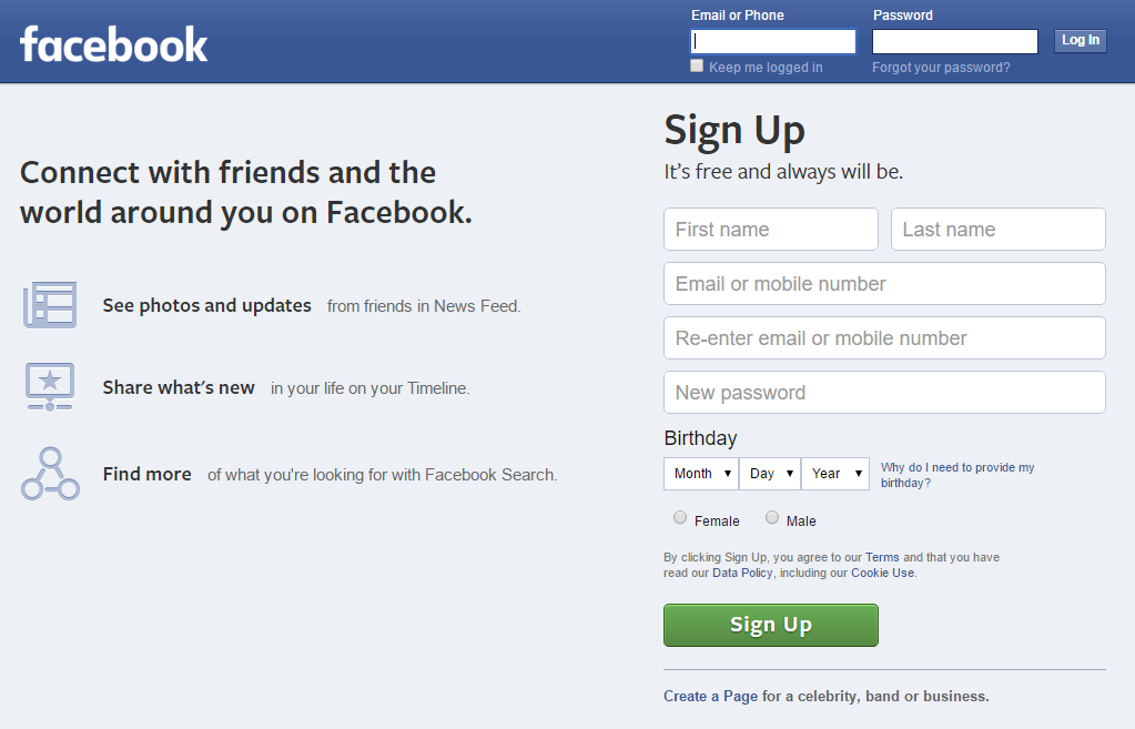
Google.com can be a search engine with no onboarding because its use and purpose is common knowledge. Similarly, Facebook.com doesn’t need to explain its social network because most of their website visitors arrive with at least a rudimentary understanding of “friending” and the News Feed. Facebook could skip straight to the value proposition, although their logged-out landing page is actually pretty concrete:
Facebook’s landing page is nearly perfect, except for the emphasis on search, which I object to on dual grounds. Facebook’s search is garbage and it’s beside the point — their core value proposition is about connecting with people you know. Screenshot taken 3/21/2016.
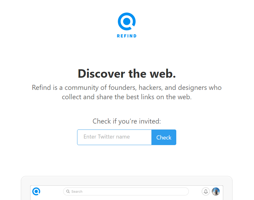
I also want to give an example of someone who is doing it wrong, in my estimation: Refind, a service for saving links. I already pointed this out on Twitter, and to the company’s credit, their founder was very open to criticism. I’m not trying to pick on Refind, but their landing page is a great demonstration of damaging vagueness. Before I explain what the Refind service does, here’s their landing page:
“Discover the web. Refind is a community of founders, hackers, and designers who collect and share the best links on the web.” Screenshot taken 3/21/2016.
From their blurb, I can gather this: Refind is a link-related service and they’re targeting people who work in tech. But I have no idea what the product actually does! “Link-related” is a huge space. My first guess was “Reddit meets Instapaper” — nope, totally wrong. If you’re pitching people on a product, this is a bad reaction to get. Website visitors should not be making wild guesses about what your product is. Communicating that should be your top priority. Here’s how I would rewrite Refind’s blurb:
Use our browser extension to save valuable links, and we’ll insert them into your relevant Google searches later. Join a community of founders, hackers, [and so on].
Below that, a cleaned-up screenshot of what a Refind link looks like when pre-populated into Google results. For example, you could save the article that you’re reading right now and tag it “copywriting”, “product description”, etc. If you searched adjacent terms in the future, Refind would offer you this link again.
That’s it. The concepts are fairly simple. I’ll reiterate the list of top priorities for a new entrant’s landing page:
Concrete explanation of what your product or service is. Don’t be afraid to be literal.
Value proposition, AKA why potential users should be interested.
Call to action, ideally a form that can be filled out without navigating to another page.
My thesis here is that website visitors who don’t understand what you’re offering are far less likely to pull the trigger. Thus the emphasis on specificity, and connecting all the dots for people right away. Make it easy for them to make a decision. Again, this is how copywriting can be thought of as a type of design — it guides the user toward your desired mindset and shows them what they should do.
I am a member of the Amazon Associates program. If you click on an Amazon link from this site and subsequently buy something, I may receive a small commission (at no cost to you).