This website was archived on July 21, 2019. It is frozen in time on that date.

Sonya Mann's active website is Sonya, Supposedly.

How To Design An Effective Billboard

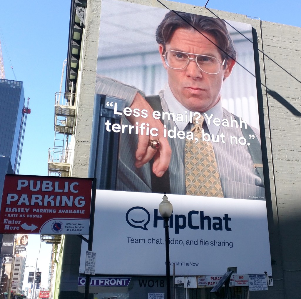
Here are two pieces of feedback that I got about my billboard manifesto: 1) “Sonya, more people have watched Office Space than you think.” 2) “This post is like the billboards that you’re criticizing.” Although I had good points (if I do say so myself, which I do), my suggestions weren’t presented in a clear, actionable manner. Hopefully this post will amend that. Most of the following design ideas apply to other types of display ads, like magazine ads or even web ads, but my specific aim is to improve billboards.

The process is slightly different for new brands versus established brands. (You are a new brand if most people have never heard of your company/product. You are an established brand if everyone already knows who you are and what you do.) The advice for new brands largely also applies to established brands, but not vice versa.

celebrate 125 years with Coca Cola
Photo by Elliott Brown.

Billboard Checklist For New Brands

#1: Define your objective. What do you want people to do after they view your billboard? Do you want them to visit your website? Buy your product next time they see it at Target? Simply remember your company when they’re prompted to think of your industry? It’s important to pin this down so that later you can evaluate whether the billboard accomplishes what it’s supposed to. Keep in mind, as a new brand, that getting your name/logo/image in people’s brains is CRUCIAL before you can expect anything else.

#2: Include essential information. These things MUST be on your billboard, and they must be big and readable: the name of your company, what your product is/does (if there’s room, also why people should want it), and where people can get it. Textually, here’s an example:

Safer Dog Leashes
made by Company Name
available at companyleash.com

Accompanying the text would be a picture of the dog leash. That’s it. Simple is good! People need to be able to process the information quickly, with little attention and zero intention. Prioritize clarity, and when in doubt, enlarge the font!

blowing a giant bubble
Your text should be as big as this bubble. Photo by Thangaraj Kumaravel.

Billboard Checklist For Established Brands

#1 is the same: Define your objective. How do you want people to react to your billboard? What do you want them to do? As an established brand, you may be playing a longer game, oriented toward perception as well as action. Do you want people to start associating your product with luxury, business, fun? Etc, etc.

#2: Signal your brand. You don’t need to lay out everything about the company and what you do, but you still need to show whose billboard this is. In a legible way! Depending on how well-known you are, this can mean putting your company’s name in a corner, or in some cases just the logo. Make sure that people can tell, from far away, what brand the billboard represents.

shot on iphone 6
Photo by Elvert Barnes.

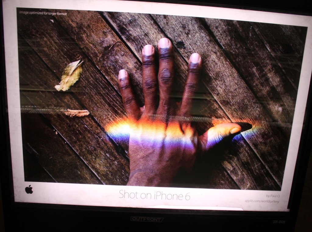
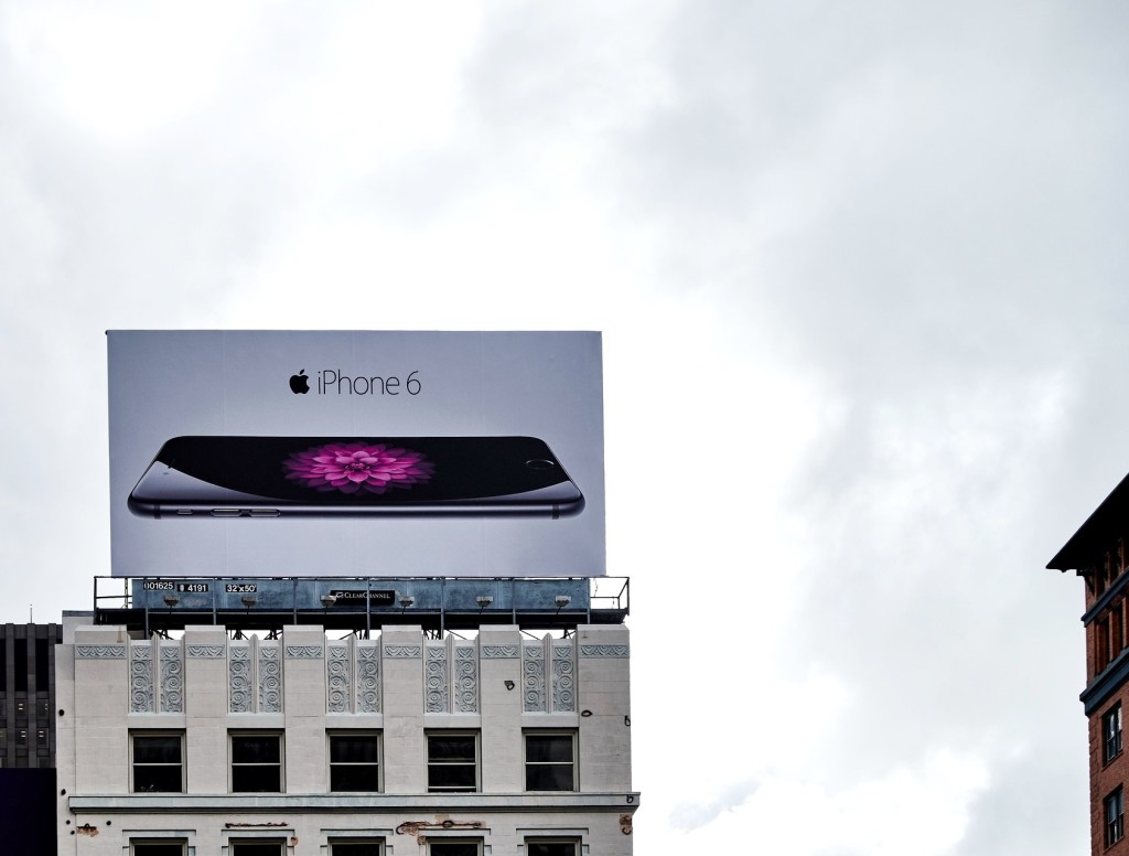
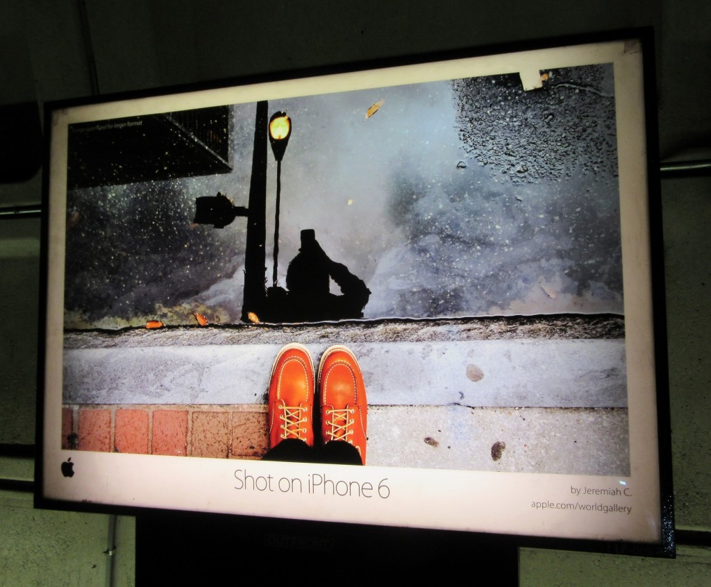
#3: Core message. Suppress your desire to be clever. Jokey or sarcastic billboards can be done well, but it’s so infrequent that statistically speaking, you’d do better not to even try. Be straightforward. To use the example of “Shot on iPhone 6”, the core message is, “The iPhone 6 has a really good camera.” Boil down your core message to be as simple as possible. If you use text, use LARGE text.

HELLO light art installation
Artwork by Peter Liversidge; photo by See-ming Lee.

Now I gotta backtrack. Before you do anything: Step zero in any kind of marketing endeavor is to consider, “Is our [product/service] valuable? Why should people want it?” If whatever you’re offering isn’t useful and desirable, go back to the drawing board before you try to sell it. If you’re in a position where you can’t amend the product to make it better, your job is going to be a hell of a lot harder. More on that here: “The single worst marketing decision you can make” by Ryan Holiday. Also, this memo from Stewart Butterfield to the internal team at Slack (a workplace communications system) is a must-read. Salient quote:

“Just as much as our job is to build something genuinely useful, something which really does make people’s working lives simpler, more pleasant and more productive, our job is also to understand what people think they want and then translate the value of [our product] into their terms.

A good part of that is ‘just marketing,’ but even the best slogans, ads, landing pages, PR campaigns, etc., will fall down if they are not supported by the experience people have when they hit our site, when they sign up for an account, when they first begin using the product and when they start using it day in, day out.”

That’s it! Let me know in the comments, on Twitter, or via email (sonyaellenmann@gmail.com) whether you think this post is correct, super wrong, or how it could be more helpful. Feedback is welcome. Thank you!

Why Your Company’s Billboard Sucks

iPhone 6 billboard ad in San Francisco
Photo by Kārlis Dambrāns.

I like to critique billboards (read: make fun of them). There’s plenty of material along the freeway or in downtown areas. A few of them are good. The frequent winner is Apple, with their colorful-but-minimalist ads. Recent displays have been boring–dude, I know what an iPhone looks like–but at least they make sense. (Granted, the “Shot on iPhone 6” campaign is brilliant, but I haven’t seen it many places.)

Most billboards are headscratchers, especially Verizon and AT&T ads, which are full of inscrutable acronyms. To this day I don’t know what LTE stands for, and I don’t care enough to look it up. This indicates that Verizon and AT&T have failed, especially since I actively pay attention to advertising, unlike most people.

Verizon billboard
Photo by Mike Mozart.

Verizon proudly announces, “We’ve doubled our 4G LTE bandwidth in cities coast to coast.” Okay, um, what does that even mean? Here is a better thing for Verizon to say: “Fast, reliable texting and data, available all over America.” Or something to that effect, preferably shorter and simpler.

People seem to think it’s fine to resize a magazine ad and slap it on a building. They are wrong! Often the magazine ads aren’t very good in the first place, so this is doubly ineffective. I am consistently amazed by how many billboards neglect to communicate extremely basic information: 1) the company’s name, 2) what the product is and what it does, and 3) what action the potential customer should take.

Here is a train billboard for a good cause that totally fails:

Are you 1 in 26? Epilepsy billboard on the train
Photo by Elvert Barnes.

When you look at this ad, the immediate question is, “Am I one in twenty-six what?” The answer is “epileptics”, but unless you stop to examine the lower lefthand corner, you won’t figure that out. Very few people are going to slow down to closely examine the small print. This ad just doesn’t work, because billboards are usually not the place for high-concept, or even intermediate-concept, artwork. Billboards need to be punchy, delivering their message immediately.

billboard: Shot on iPhone 6
Photo by Elvert Barnes.

There are situations where you can ignore the basics. For instance, if you’re Apple and everybody already knows what your brand sells and how to get it. At that point you can do high-level emotional marketing. (See also: beer and car ads.) Most brands are not in this position. They try to be clever and complex, although it would be wayyy more effective to say, “We are [name]. We sell [product]. Find us at [location/website].” A+ if you can figure out how to say that your product is superior, but brand recognition is probably all you should shoot for with a billboard. Remember, most people aren’t paying attention. They’re looking at the road. If they’re on the train, they’re looking at their phone. Your billboard should be SUPER SIMPLE, easy to comprehend at a glance.

HipChat billboard ad, a play on the cult comedy Office Space
Photo by Elizabeth Krumbach Joseph.

The HipChat billboard above toes the line between “Ahhh I see what you did there, that’s funny” and “Huh?” Joking about the horrible boss from Office Space is cute, but you have to pay attention to the ad to get it. You also have to have seen Office Space. (Steve Carell’s character from The Office would have been a similar-but-better choice.) Sure, some people are going to notice the billboard, get the joke, and enjoy it, but most people aren’t going to pay attention long enough to go through all that. At least HipChat’s logo is big and readable, but the explanation of the service is too small for people to scan while changing lanes.

I could do more examples, but I’ve probably harped on this enough now. What do you think? Comment below, or hit me up on Twitter/Facebook.

UPDATE: I wrote an instructional follow-up post.

Office Space boss

Native Advertising Hubbub

Edit: Contently studied this topic with disturbing results. I reserve the right to revise my opinion!

I wrote the following post in response to a brief Twitter conversation (screenshotted below) and an article by Jeff Jarvis: “WTF is promoted-native-sponsored-brand-voice-content? It’s an ad. That’s WTF it is.”

what is promoted content

Anthony De Rosa (chief editor of Circa News) has a point. In effect, sponsored posts are advertisements. But the experience of reading one is more complex than that.

No one is going to click on an article billed as an advertisement. They shouldn’t, because reading several hundred words of traditional advertising copy would be tiresome. However, paid-for editorial can feel different from a hard-sell ad. Using a new term for a distinct practice does not constitute deceiving readers. Jarvis’ survey demonstrates that the terms currently being used are inadequate, but that doesn’t mean “advertisement” is the only option. I agree that clear language is needed, but I don’t agree with the conflation of regular ads and “content marketing”.

To cite an example that I’ve used before, this is a traditional Marriott ad:

Marriott hotel ad

Whereas this is a post sponsored by Marriott:

post sponsored by Marriott

Underneath the vague disclosure—that part is not exemplary—is an actual story. Marriott paid for the essay and I associate it with them, but the text ignores Marriott. An unnamed hotel is mentioned once, but that’s as close as it gets. The purpose of this sponsored post is to link luxurious wandering with Marriott, which it accomplishes. Without being totally evil.

TL;DR? Be honest with readers, yes, but there’s no need to unnecessarily hamper native advertising. It’s frequently executed abysmally, but so is everything.

Identity Blogging?

Some realizations:

1) I want media to be funded by native advertising (AKA “advertorial” “content”).

2) Caveat: I want native advertising to be clearly marked as advertising. In general, I want biases to be forthrightly declared. (I wrote about that recently.)

3) My goal work situation, the ideal daily setup, is to slowly build long-term projects—books—and to write a couple of web articles per day, totaling roughly one-thousand to fifteen-hundred words.

I’m considering what niche to focus on. Currently, I am looking at identity. That is my most enduring interest, the way of examining the world that I default to. It’s a kind of organizing principle.

Blocking Ads Is Actually Good for Content Creators

A lot of “content creators” — the people who make the internet worthwhile — hate ad-blockers. I don’t. I am glad that ad-blockers exist, and I think they’re actually good for the future of “content” and editorial websites in general.

First let’s review the argument against ad-blockers. (Note that sketchy ad-blockers do exist, but assume I’m talking about normal ones like uBlock Origin.) Basically, ad-blockers stop display ads from loading. This means that websites can’t make any money from the visitors who use these browser extensions. (The idea that web ads only pay per click is a common misconception — most professional websites are paid per thousand views.)

When websites can’t make money, they can’t pay the people who write for them, and then those people are out of a job. Plus, the internet starts to degrade. This point of view has been chronicled extensively, most notably on Ars Technica, a popular geek site that experimented with blocking the ad-blocker users right back. Other good articles include the explanation on This Interests Me, Andrew Taylor’s “AdBlock Is A Bad Thing”, Network World’s “Why do AdblockPlus users hate my kids?” (lol), and finally a Hank Green video.

Examples of Display Type Beside a Column of Plain Letter-Press
Image via History, Philosophy, and Newspaper Library.

Here’s what I think: Making money from advertising is not an inherently terrible plan. Making money from display ads is. Banner ads and noisy autoplay videos are not the only option! Dreaded paywalls are not the only alternative. (Besides, subscriptions won’t be sufficient unless you have a premium legacy brand like The New York Times, or niche appeal like Andrew Sullivan’s political commentary.) Here is an example of what a respectful ad looks like:

Please consider shopping through our Amazon affiliate link to support this website. We rely on readers like you to keep creating the [content type] that you love!

This is basically how fashion bloggers do it, although some of them are less obvious about disclosing their affiliate links. The techies may not have noticed, but fashion and lifestyle bloggers are doing well for themselves! You should be copying them. There are plenty of affiliate programs, and a website with a decent amount of traffic can probably make more money from this type of advertising than from display ads. (Granted, some of the protests were written years ago, so this may not have been true at the time.)

The other excellent idea is sponsored posts. Ars Technica contributor Kurt Mackey commented on the article that I linked above, “There are really two possibilities […]. The first is what we’re striving for: finding the least offensive level of advertising […] while keeping our overhead as low as we can. The second is scary and more malicious, and if Ars ever went this way I would no longer work here: disguising ads as content.” I agree, but sponsored posts don’t have to be disguised. All you need is a disclaimer. Example:

The following post is sponsored by [commercial entity]. Please consider doing business with the brands that support [website]. Thank you!

Readers have been duly informed, and they can scroll past if they don’t want to read an advertorial. Actually, the best type of sponsored post has that disclaimer at the top, and then normal content below that is vaguely related to the field of the sponsoring entity. Here is an example from a Medium article by Jason Harper, “In Defense of the Good Old-Fashioned Map”:

sponsored post example

The disclaimer could be a little more explicit — “Sponsored by Marriott” would be better than “Presented by Marriott” — but in general this is well-executed. The visual experience is not annoying, I get to read something enjoyable, and I will associate my happy internet feelings with Marriott. Win-win-win for the creator, the advertiser, and the reader.

People who protest sponsored posts are generally concerned with objectivity. For instance, if you review a product that was sent to you for free, and the company is paying you to review it, can you offer an unbiased review of that product? Well, no, of course not. Presumably the people who worry about this are the same people who complain when news writers use personal pronouns.

What the critics don’t seem to realize is that objectivity is not a thing. It straight-up doesn’t exist. Literally every single person in the entire world is biased — deeply biased — in one way or another, because that is human nature. We’re irrational animals, not logical automatons. The important thing is to declare your biases, for example by disclaiming the sponsored nature of a blog post.

practice_adblock
Image by yuichirock.

So why do I think ad-blocking will be good for the future of the internet? Because it will push websites to rely less on irritating ads, and implement user-friendly business models instead (which may include sensible advertising). Sure, plenty of websites will be unethical and not use disclaimers, but that’s why we have to be discerning, skeptical consumers, both of media and any products we choose to purchase.

Too long; didn’t read? Here’s my basic point: it is worthwhile to develop a revenue stream that doesn’t annoy your readers so much that they block the revenue stream altogether.

Sign up for my newsletter to stay abreast of my new writing and projects.

I am a member of the Amazon Associates program. If you click on an Amazon link from this site and subsequently buy something, I may receive a small commission (at no cost to you).