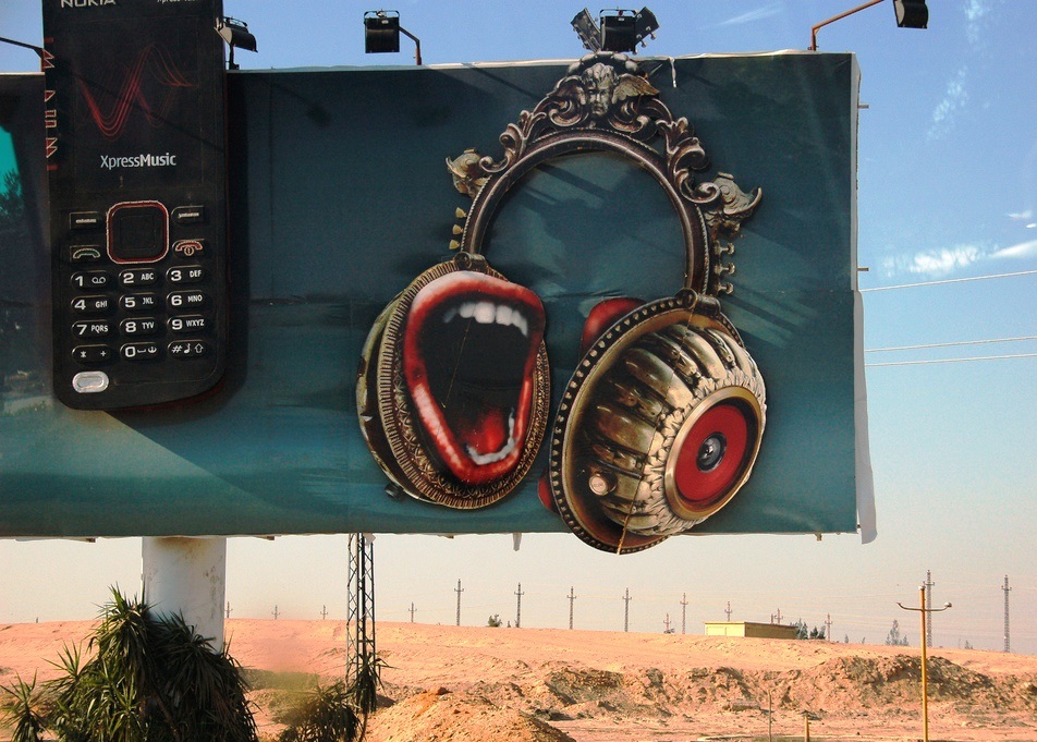
Obviously this billboard wins when it comes to design. The mouthy headphones and three-dimensionality are eye-catching. But how about the necessary intellectual aspects?
Well… the billboard conveys a sense of rock-‘n’-roll brashness, and you can identify the brands Nokia and XpressMusic if you look closely. Obviously it has something to do with cell phones (back in the quaint old days of flip phones). But what is the message of the billboard? What is it proposing to the viewer? Mysterious. The think component is not spelled out sufficiently.
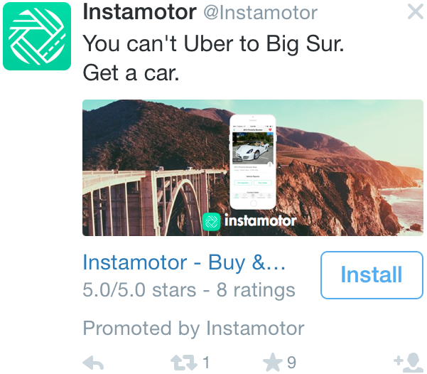
I encountered this Instamotor ad on Twitter (on my phone, since I use AdBlock on the web). I think it’s a pretty good ad, even though I’m not convinced that car ownership is a better deal than Uber. Let’s evaluate Instamotor’s ad based on the principles of People-Optimized Marketing, summed up by the keywords think, feel, act, and design.
THINK: The caption reads, “You can’t Uber to Big Sur.” Your brain is immediately prompted to fill in the missing information. Why not just take Uber? Because it would be super expensive. Why go to Big Sur, anyway? Because it’s beautiful (reinforced by the photo). This has further implications…
FEEL: Thinking about Big Sur, looking at the snapshot of pretty California scenery, contemplating a weekend getaway… Feelings of pleasurable freedom, maybe even nostalgia. Now you’re going to associate those emotions with Instamotor, and the idea of driving to an idyllic camping spot.
ACT: You can tap the button and download the app, which is quite direct. This is one of the few scenarios where the viewer is able to act posthaste, which is a cool thing about mobile ads. Alternately, you can fave the tweet, retweet, and/or follow Instamotor.
DESIGN: In my opinion, the visual would work better without the iPhone screenshot imposed on the Big Sur image. Besides that, well done.
Many marketers don’t consider how normal human beings will interact with their advertisements. This dilemma spans the profession, evident in the work of creative directors, designers, copywriters, account managers, etc. People-Optimized Marketing is a rubric for considering how marketers’ output will perform, based on simple principles.
Effective advertisements make the viewer think, feel, and act. In order for those reactions to be provoked, the visual design must be clear and interesting.
Curiosity gaps coax viewers into thinking. Ads should give the viewer just enough information to prompt them to finish the story, drawing connections in their own mind. Guide the viewer toward a particular narrative without spelling it out entirely.
How do good ads make people feel?
Emotional responses are simple. For the most part, people care about other people, preferably specific people with faces and personalities. Ads can also use symbols and connotations to evoke particular moods, like this ad that shows buildings about to domino into catastrophe:
Most ads won’t get the viewer to make a purchase right away. Rather, good ads give people what they need to act later. The product or service is identified, the brand is clear, and ideally the product is positively differentiated from what the competition offers. Triggers are another important consideration, as discussed in Jonah Berger’s study of virality, Contagious.
What makes an ad well-designed?
Design is more subjective than the other categories. In general, prioritize clarity and simplicity. Viewers need to be able to read the caption (if there is one) and identify the branding. I’ve written about this extensively when it comes to billboards. If you can make the design interesting or beautiful, that’s icing on the cake! Remember, cake needs frosting to be delicious.
Obviously not. People-Optimized Marketing is more about attitude than specific mandates. That said, ads that neglect to make viewers think, feel, and act are missing the opportunity to really engage viewers.
Click here to see all my posts about People-Optimized Marketing.
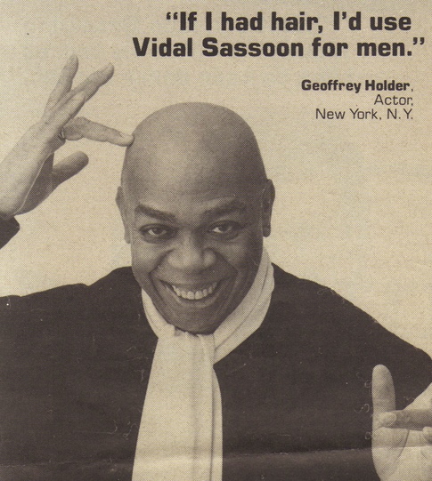
Actor Geoffrey Holder, quoted in an ad that ran in Rolling Stone in 1985: “If I had hair, I’d use Vidal Sassoon for men.” I think this ad is brilliant. Let’s evaluate how it prompts the viewer to think, feel, and act, then look at the visual design. I’m trying this four-pronged rubric as a way to examine ads and understand what they do right.
THINK: As soon as you read the caption, the contradiction is obvious. An ad for a hair product, promoted by a bald guy? That’s silly! You also process that Vidal Sassoon has to do with hair. Even if you’ve never heard of the brand before, you can easily tell what their business is.
FEEL: There’s something inherently funny about a bald guy shilling shampoo and pomade. You are amused. Geoffrey Holder’s smile is friendly, welcoming. He connotes vitality and artistic panache — Holder was a Trinidadian-American performer in New York. If you watched TV in the 1980s, you might remember him from 7 Up commercials:
In 1985, when Rolling Stone carried this Vidal Sassoon ad, Geoffrey Holder would have been familiar to most readers. The work he did for 7 Up boosted his work for Vidal Sassoon, giving the second company more bang for their buck.
ACT: The caption emphasizes Vidal Sassoon’s brand name without being clumsy or pushy. Next time you browse the shampoo aisle, positive associations will be swirling around in your brain, probably under the threshold of consciousness but powerful nonetheless.
DESIGN: The photograph and caption are simple, easy to read/understand, and pleasant.
That’s it! What do you think? Is this a good way to evaluate advertisements? Do you agree with my interpretation?
How to fund online journalism? For the most part, the conversation has focused on advertising. Hampton Stephens, founder of the self-sustaining World Politics Review, finds this puzzling. He cautions websites backed by venture capital, like BuzzFeed and Vox:
“The lesson that most media startups seem to have taken from the evisceration of advertising-supported journalism over the past two decades is that more innovation is needed… in advertising. […] To ensure the kind of ‘accountability journalism’ that is critical for any democracy to flourish, well-funded new media players must experiment with models other than advertising.”
Apparently everyone wants to copy the free metropolitan weeklies stuffed with “medical” marijuana enthusiasts. (No offense meant, East Bay Express.) A few high-end legacy newspapers—and premium newcomers like Stephens’ World Politics Review—have made subscription systems work, but only up to a point. The signups are slowing down. So… that’s it. Alternatives are strangely infrequently discussed, despite the occasional hat tip to research divisions.
Here’s the problem: Advertising works reasonably well when a website is deluged by traffic, but what about smaller operations? Are niche editorial websites doomed, or are they thriving? The general trend can be difficult to track, but journalistic endeavors of all sizes are trying to guess how they will be funded in a mobile-first world populated by Millennials who balk at paying for information.
I am a member of the Amazon Associates program. If you click on an Amazon link from this site and subsequently buy something, I may receive a small commission (at no cost to you).